Ingeun Kim | ingeun92@naver.com | CURG
This article was originally written in Korean, and you can find it here !!

In this article, we will explore the basic knowledge for cryptocurrency trading, which is inseparable from the blockchain world. Of course, the content related to charts explained here can be used not only for cryptocurrency trading but also for any other type of trading. Therefore, it can naturally be applied to stock trading, commodity trading, and foreign exchange trading as well.
You may ask, “If you know this well enough to teach it, you must have made a lot of money from trading, right?” However, both of those assumptions would be incorrect. First, I am not someone who knows charts exceptionally well compared to others. There are truly many reclusive experts in the world of trading, so I cannot claim to know better than them. I am still learning myself. I simply want to share some of the basics that I know. As for making a lot of money…rather, I have lost money. Although it did allow me to studiously study charts out of necessity. (Professionals call it “paying tuition.”) So I hope you’ll enjoy reading this with the understanding that I only know the basics of chart analysis.
The Importance of Charts in the Trading Process
If you know anyone trading stocks or cryptocurrencies, you may have witnessed them with their chart windows open, full of colorful lines and bars. While some traders do analyze these charts for useful information, others may just be checking prices or pretending to analyze for appearance’s sake. But what importance do charts really hold in the trading process?
I would describe a trading chart this way: “It is a visual representation of the accumulated trading and psychological information of all participants in that market.” In other words, it conveniently displays all the trading and mindset data from the traders — information you’d otherwise have to individually ask each anonymous participant.
For a simple example, if at a certain point the price chart is rising compared to the previous point, that means the buying volume (amount) exceeds the selling volume at that time. And if we assign a value of 1 to buyers’ sentiment, -1 to sellers’, and 0 to observers’, then a rising chart indicates the overall market sentiment is weighted towards buying over selling.
Of course, insider information and rumors can also provide critical data beyond just charts. Especially insider info can be the best data if you have access before others. However, obtaining such info is extremely difficult. So consider this: even without direct access to premium info, if you can just analyze it slightly faster than most other traders, you can still succeed. How?
As described earlier, charts visually represent the accumulated trading and psychological information of all participants. So if premium information starts circulating from a privileged few, those who know will trade with conviction, and this will be reflected in the chart patterns. By studying the charts, we may not be insiders, but we can pick up on informational advantages over those not analyzing the charts as thoroughly once that info has spread to some degree. This informational edge can increase trading success probabilities.
Ultimately, trading charts are the big data accumulated from all the information in that market. While utilizing this data doesn’t guarantee accuracy due to the market’s constant variables, if you can maintain an informational advantage over other traders through your chart analysis, you can navigate trading more smoothly.
With the importance of charts explained to some degree, let’s now look at how to actually analyze charts.
Basic Chart Components

- Main Indicators
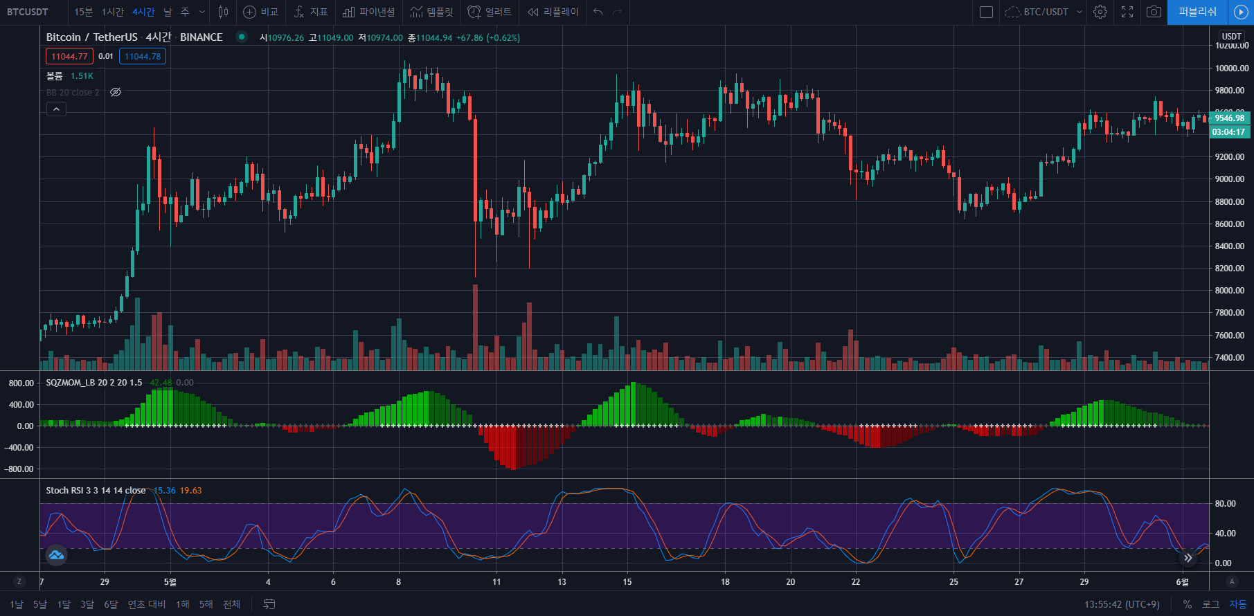
The main indicators include the price chart and volume chart. The price chart literally shows price movements, usually in candlestick form with the x-axis representing time and the y-axis representing price. It can be configured based on time periods. The volume chart represents the total trading volume (buys + sells) over a given period, typically displayed as a histogram with the x-axis for time and y-axis for volume. - Secondary Indicators
Secondary indicators are calculated based on the main indicators. They can be used to predict trends or determine entry/exit points by analyzing and visualizing the main indicator information in different applicable ways. The different types of secondary indicators have their own specific purposes and meanings, which will be further explained below.
Main Indicators
Price Indicator

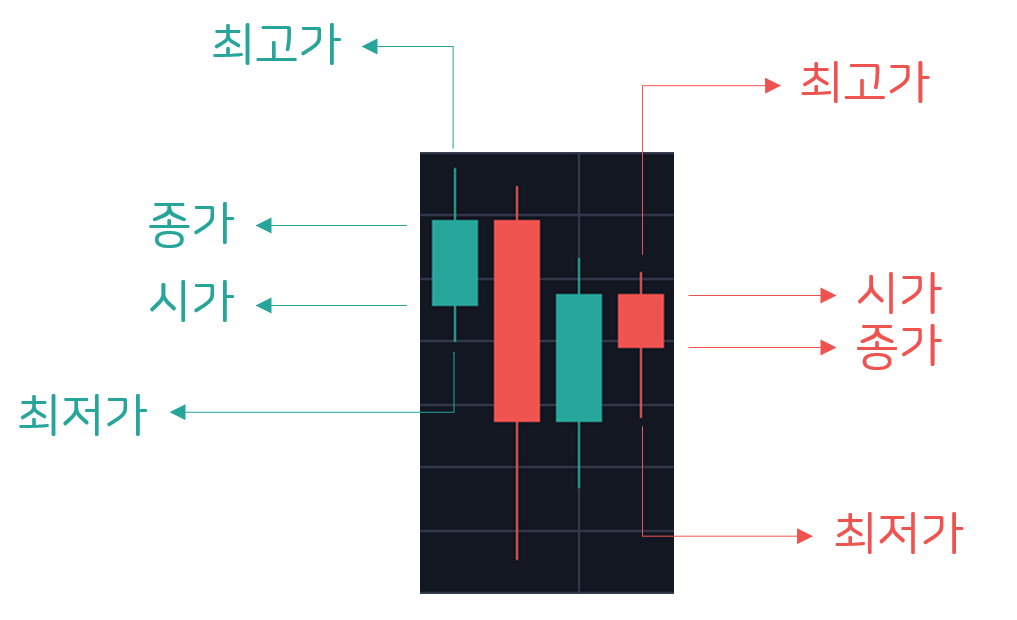
The basic candlestick price chart shows the price fluctuation within a given time period. Each candle contains the open, close, high, and low prices.
If the close is higher than the open, it forms a bullish (green) candle. If the close is lower than the open, it forms a bearish (red) candle.
The consecutive candle patterns essentially provide all price information. Therefore, this is the most important and foundational chart. You can trade based on previous support (low) or resistance (high) levels compared to the current price. Since the candle patterns directly reflect the psychology of the participants, they can guide your trading decisions.
Volume Indicator
The volume indicator is typically represented as a histogram showing the total trading volume (buys + sells) over a given period. Its color corresponds to the price candle’s color for that period — green for bullish, red for bearish.
The volume indicator reflects the psychological interest and actual trading activity of participants. While the price chart shows the trading prices regardless of volume, volume can reveal whether a price move had broad participation and legitimacy.
High volume days where the candle pattern is obvious tend to foreshadow the market’s direction going forward. So observing the candle patterns of unusually high volume days can help predict future trends.
Secondary Indicators
Moving Average (MA)

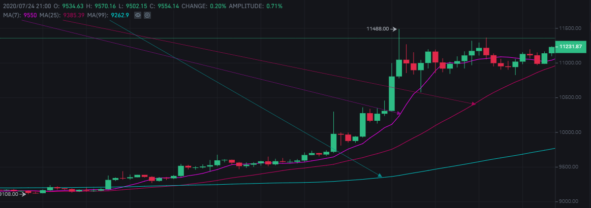
MA stands for Moving Average, which is the plotted line connecting the average of a set number (N) of closing prices over an N period. For example, if N=7, then the MA value at time t is the average of the closing prices from t to 6 periods ago.
MA can identify price support and resistance levels, signaling the overall trend direction. A price breaking above or below the MA line can indicate a trend reversal.
MACD (Moving Average Convergence Divergence) & Signal

Developed in 1979 by Gerald Appel, MACD tracks the convergence and divergence of two moving averages, taking advantage of their periodic cycles.
The four indicators of the MACD are as follows:
- MACD = 12 unit time MA — 26 unit time MA (green line in example)
- MACD Signal = MACD’s 9 unit-time MA (red line in the example)
- 0 Baseline = the baseline where the indicator value is positive/negative (straight line representing the bottom zero in the example)
- MACD Oscillator = MACD — MACD Signal values histogrammed (histogram shown relative to the bottom zero line in the example)
Here’s how to use the MACD:
- MACD Oscillator trough or when the MACD line breaks above the Signal line = buy point
- MACD Oscillator peak or when the MACD line breaks below the Signal line = sell point
- Price indicator rises but MACD falls = signal for a new high
- Price indicator is falling but MACD is rising = signal for a new low
DMI (Directional Movement Index)

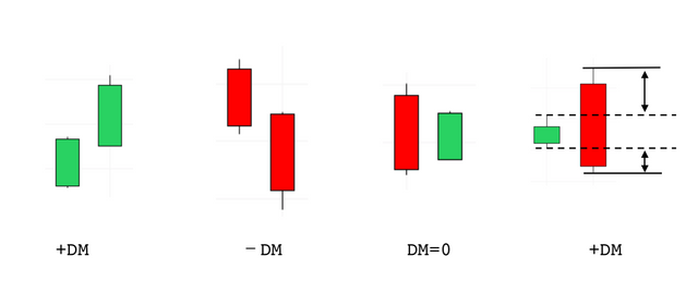
The DMI was first introduced by J. Welles Wilder in 1978 and is an indicator that quantifies the direction of a market and the strength of a trend. DM is obtained by comparing the range of highs and lows of the current unit time with the range of highs and lows of the previous unit time price.

There are four types of DM and they are as follows:
- DM is +DM when the price movement of the current unit time is above the previous unit time.
- DM is -DM when the price movement in the current unit time is below the previous unit time.
- DM=0 if the price movement of the current unit time is within the range of the previous unit time.
- If the range of the price movement of the current unit time exceeds the range of the previous unit time, the indicator is +DM if the range is higher and -DM if the range is lower.
How to use the indicator is as follows:
- PDI (green line in the example) breaks above MDI (red line in the example) = buy point
- PDI (green line in the example) breaks below MDI (red line in the example) = time to sell
Stochastic RSI (Stochastic Relative Strength Index)
The StochRSI is a technical analysis indicator that determines whether a traded item is overbought or oversold. It is derived from the RSI and was first introduced by Stanley Kroll and Tushar Chande in their 1994 book “The New Technical Trader”.
Here’s how to use the indicator:
- 20 The %K (green line in the example) breaks above the %D (red line in the example) on a chart close to the baseline (lower baseline in the yellow area in the example) = buy point
- 80 %K (green line in the example) breaks below %D (red line in the example) on a chart close to the baseline (upper baseline in the example yellow area) = time to sell
In Closing
We’ve covered the importance of charts in trading and some commonly used secondary indicators. Charts essentially visualize the accumulated effect of all data influences in a market, providing potential trading cues. While not infallible, charts present raw information from all participants, so utilizing them skillfully can greatly aid your trading endeavors. With that, I sincerely hope this guides everyone towards successful and profitable trading.
